Close
Back to Top ↑
Product Scale
Years of operation
Peak concurrent players
Product Scale
Context
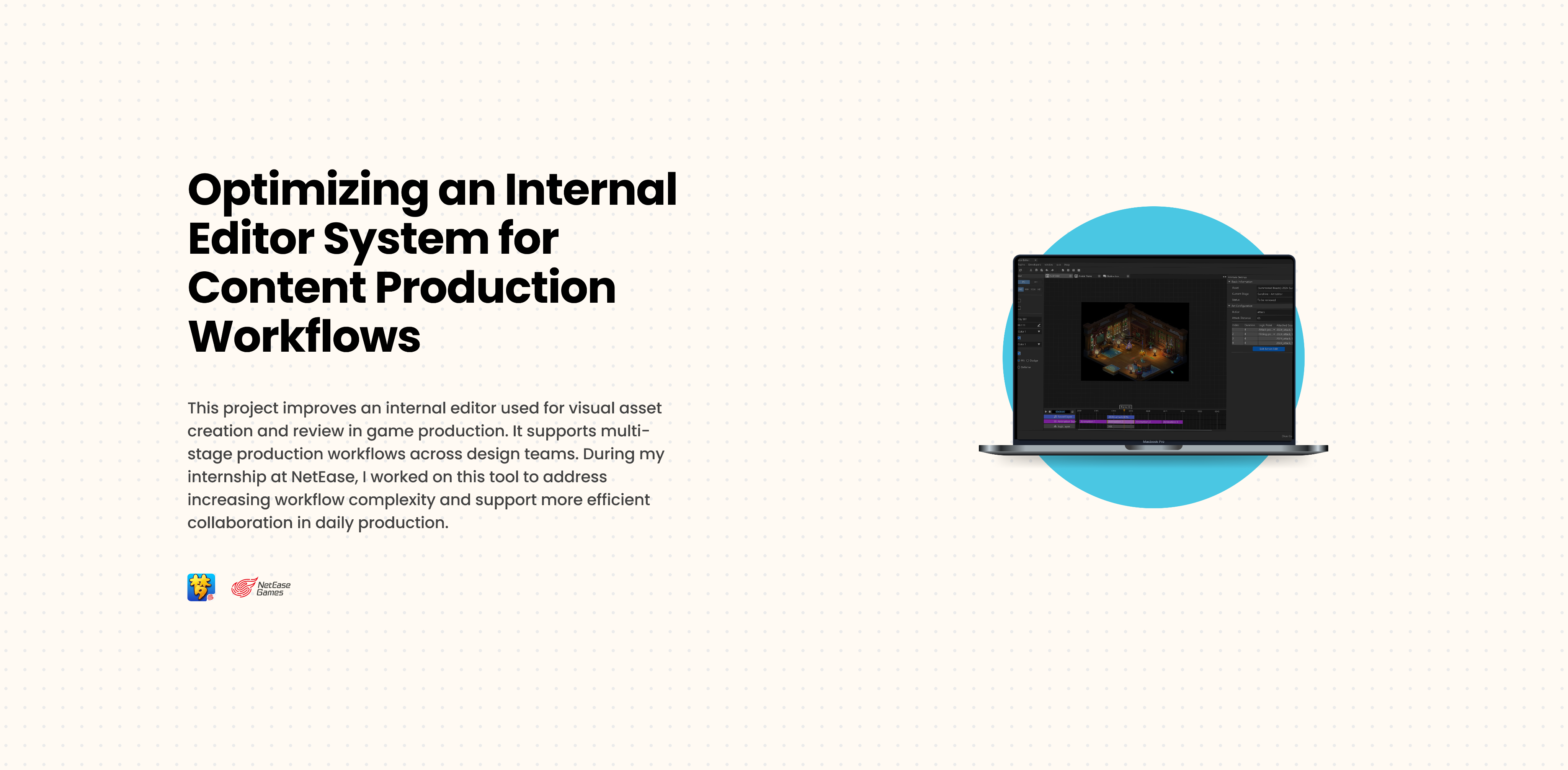
During my internship at NetEase, I worked on an internal game editor used by multiple design and production teams. The tool supports high-frequency workflows across 3+ design teams involved in task configuration and animation & audio creation.
3+
Internal design teams supported
100%
Interaction consistency across editor modules
1
Shared component system
Challenges & Constraints
The editor supports a long-running digital product active since 2013, where legacy systems and multi-platform requirements limit how interactions can be updated. As the editor scales to support increasingly complex editing scenarios, high information density makes it harder to quickly identify primary actions and increases cognitive load during daily tasks.
More Controls or More Focus?
The editor operates within an established production ecosystem. Any interface changes need to align with existing structures, limiting how much the experience can be simplified or redefined. This led to a key design question:how to balance control density with interface clarity? Below are two examples of design improvements I worked on.
I designed an action editing mode and integrated it into the existing interface without disrupting the overall workflow in this example:
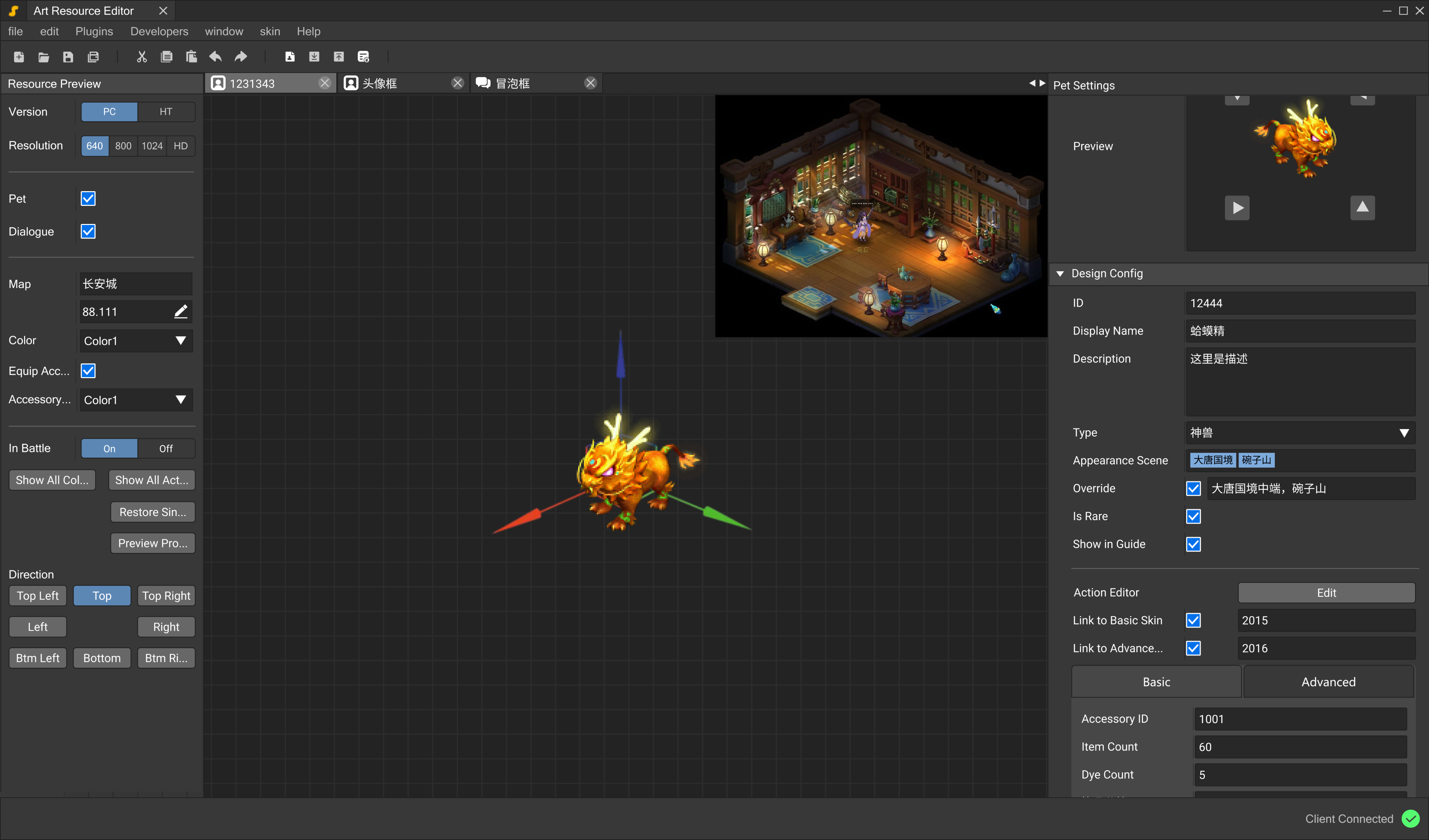


Properties Panel
Left side is for asset configuration
Viewport
For scene preview
Inspector Panel
Right side is for object arrtibutes
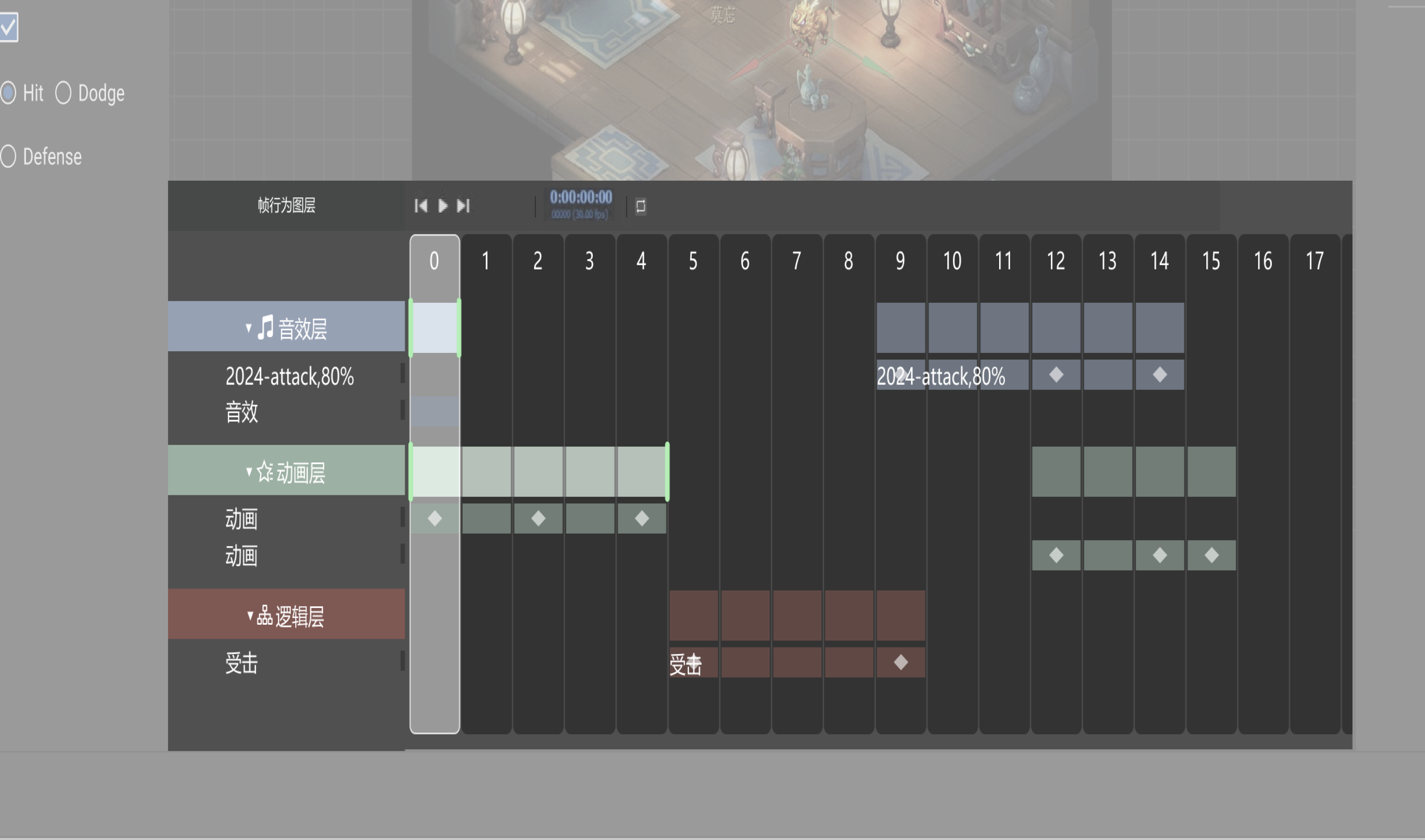
1st Iteration: Frame-Based Interaction

The purpose of the action editing mode is to let users assign animations, sounds, and logic to individual frames within a timeline. The first version emphasized individual frames. However, testing with coworkers showed that it increased learning time and made it harder to locate mistakes during editing.
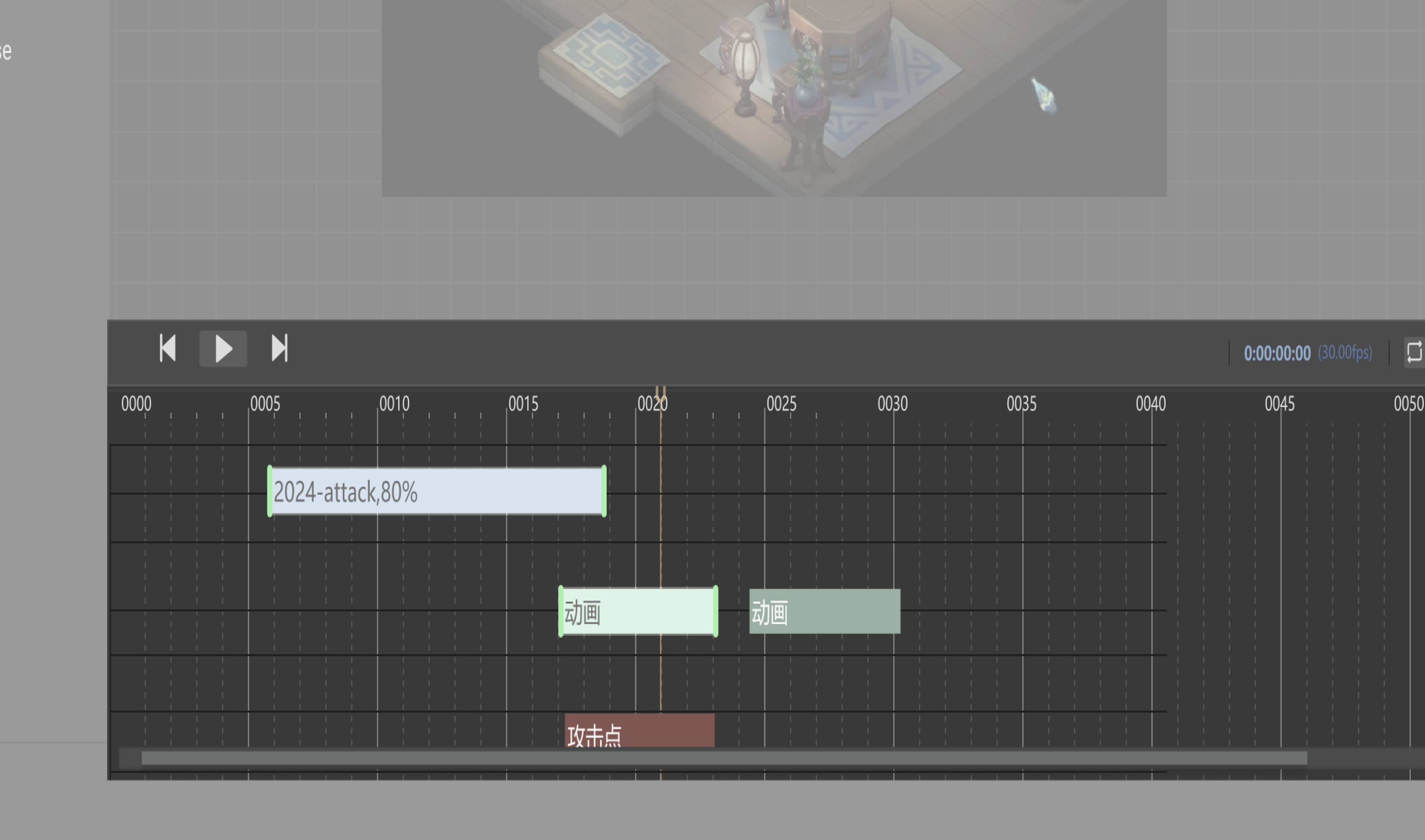
2nd Iteration: Layer-Based Frame

The second version grouped actions within each frame to reduce visual clutter. While this improved organization, users still had to scan through dense information.

Approved Iteration: Layer-Based Timeline

To address issues identified during user testing, I reorganized the timeline structure and simplified action representation. This process reinforced my approach to designing complex tools with a stronger focus on structural clarity.
Layer


Layer
Layer

Layer
Layer
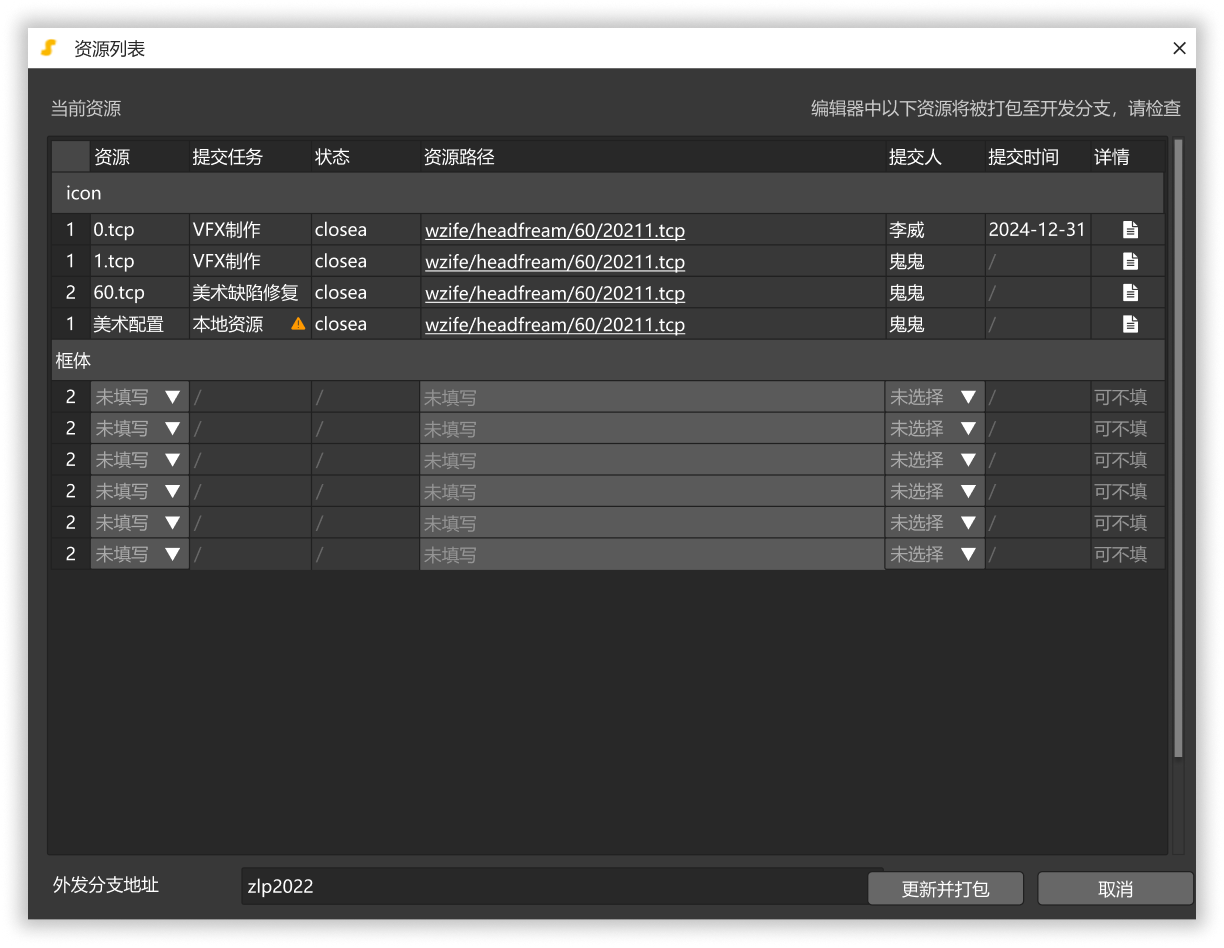
This example is about structuring a task management interface. Based on user needs, I first mapping the workflow then organizing actions into primary, secondary, and contextual layers. This approach improves usability by clarifying interaction/task priorities.
Asset Request
Task Creation
Task Assignment
Approved
Under Review
Revision


Asset Submit
VFX Submit


Design Edit
Final Art
VFX Production


Final Approval
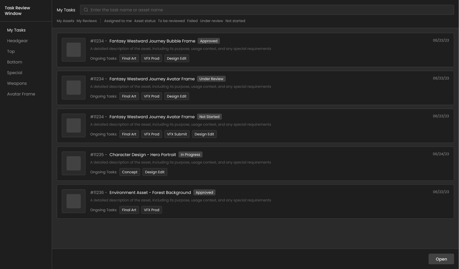

Primary
Secondary

Context

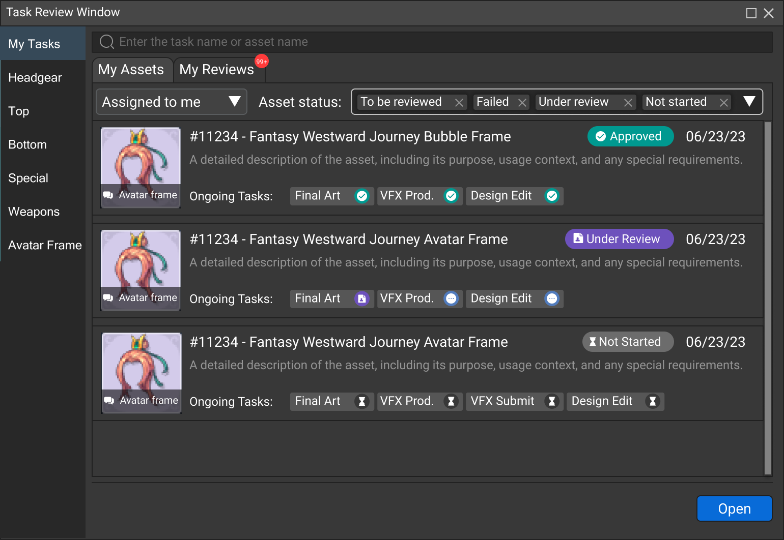
Design System & Collaboration
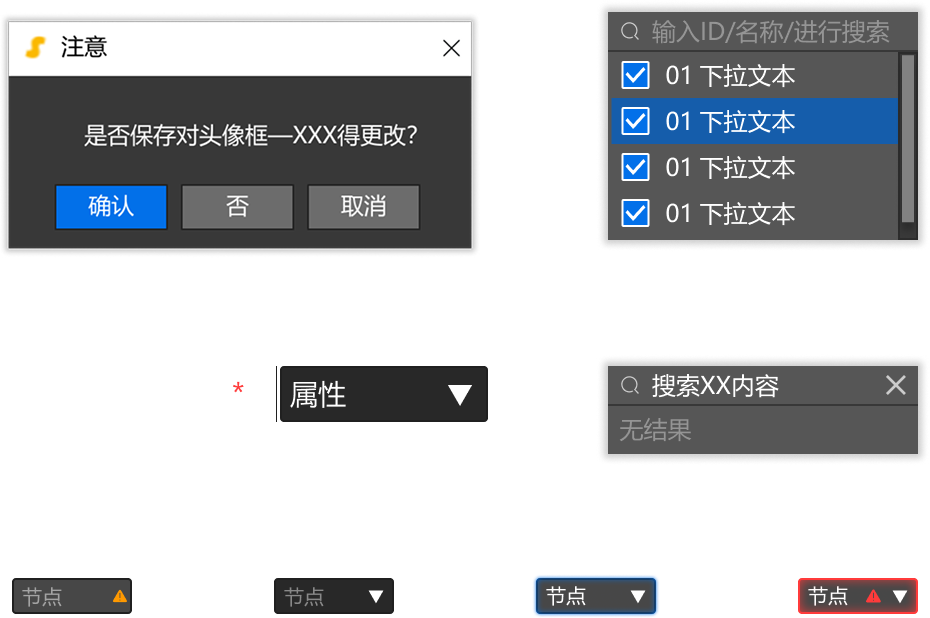
I contributed to maintaining and evolving a shared design system in Figma. The system was aligned with engineering implementation to help reduce UI inconsistency and support reuse across modules.